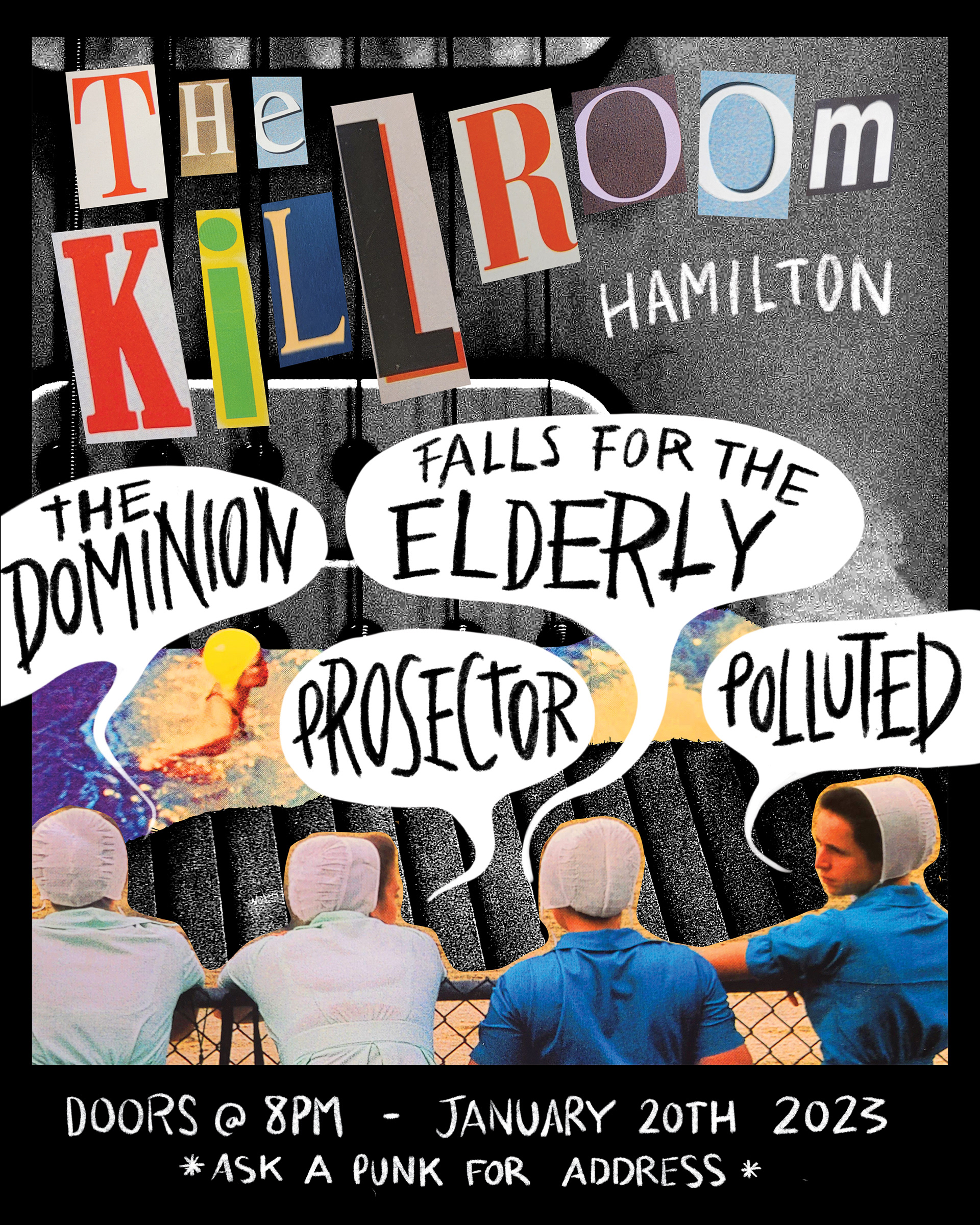
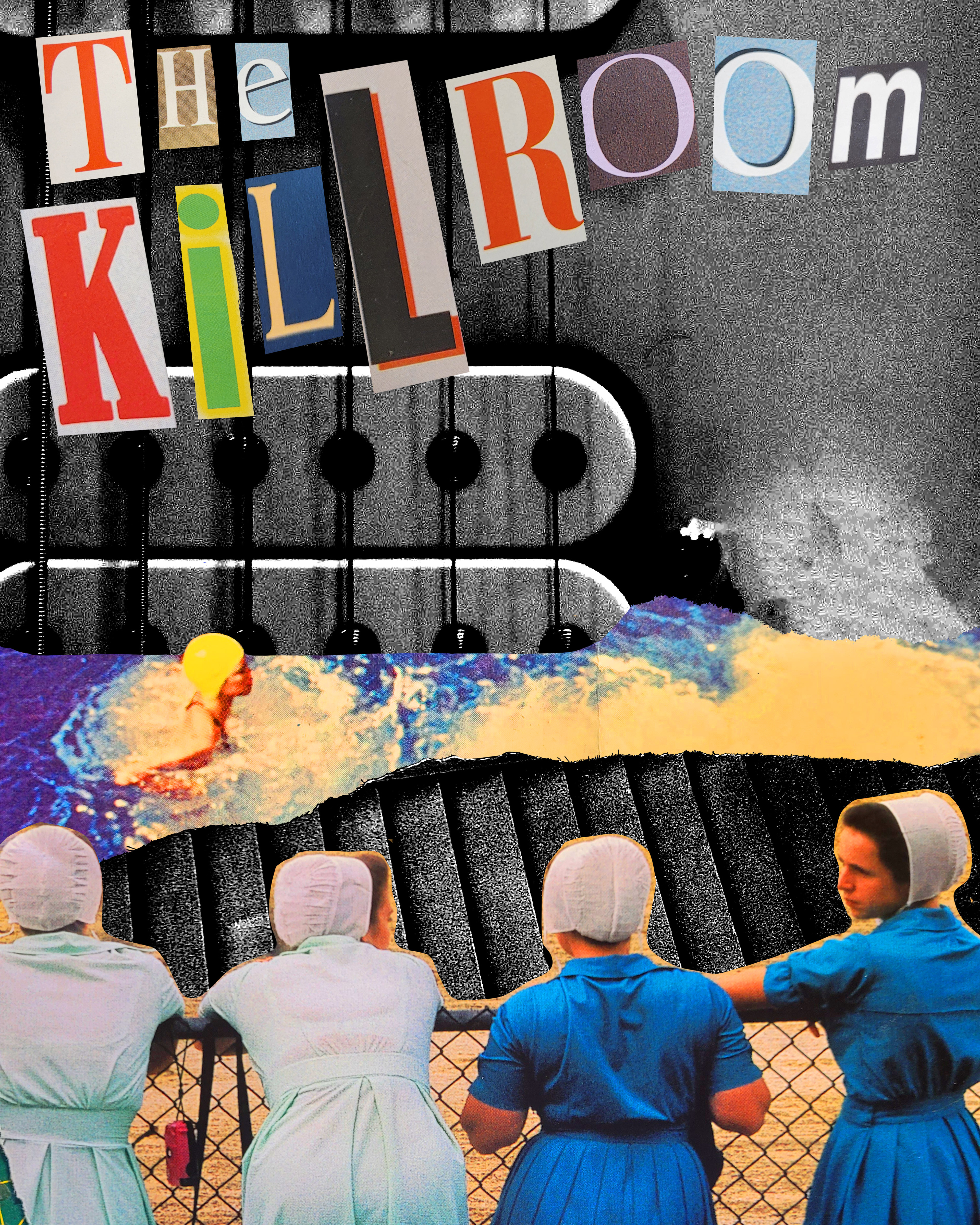
Client: Falls for the Elderly + Killroom Hamilton
London hardcore band, Falls for the Elderly, reached out to me asking for a gig poster for their January show at Killroom Hamilton. The Killroom was a skatepark/concert venus that boasted a uniquely gritty style and they wanted the poster to match that same energy.
In creating this poster design, I scanned cutout magazine images and letters into Photoshop to make a unique, scrapbook-y collage for the main image. To further drive home the DIY nature of the Killroom, I used a grainy charcoal brush to handwrite the rest of the information using ProCreate.
Medium/Tools Used: ProCreate, Adobe Photoshop, Scanner

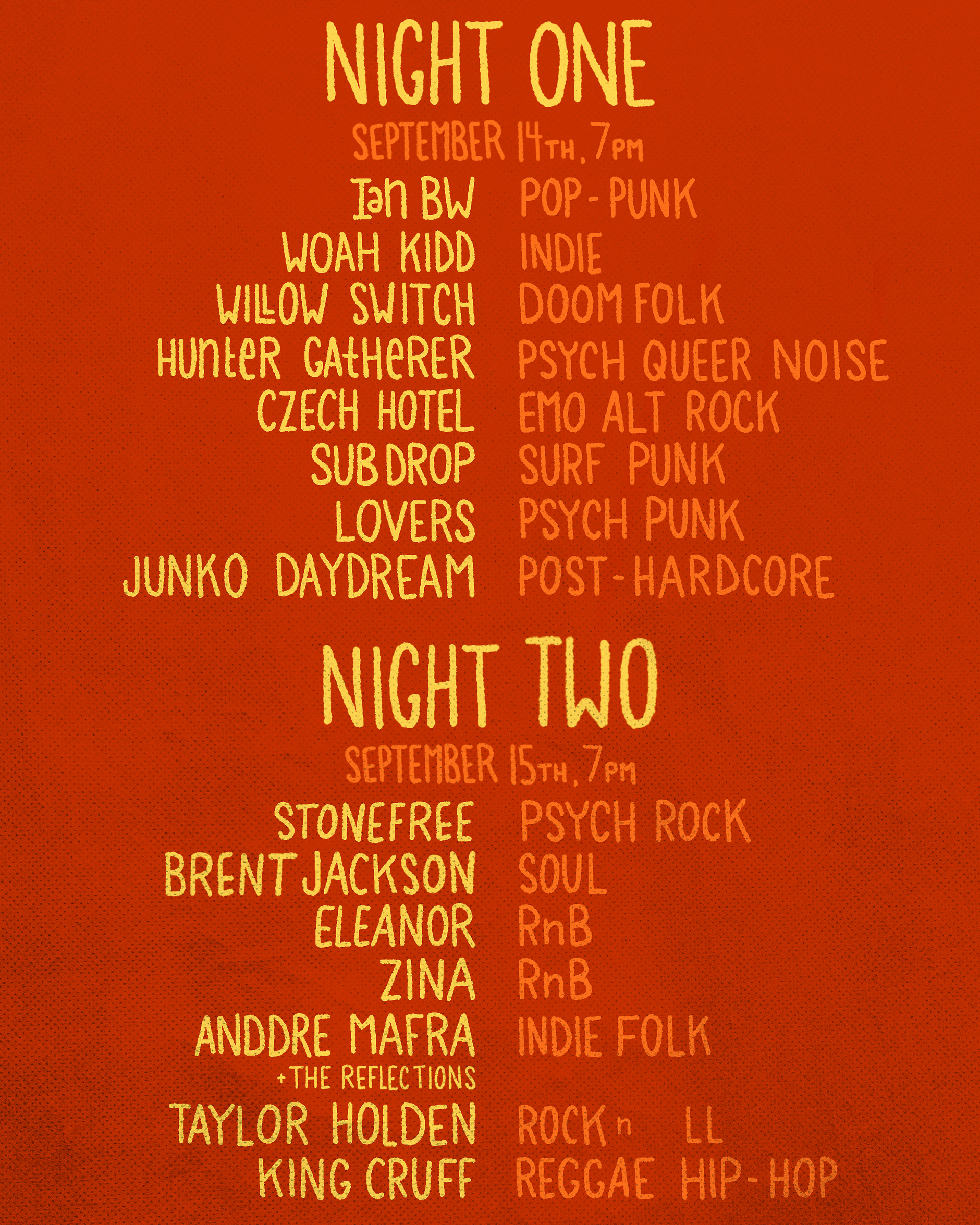
Client: Stompbox London
Stompbox has been a long-running client of mine for some time, so naturally, I was their first choice in picking someone to design graphics for their biggest event to date. Stompbox required a poster for this two-night event to be used in social media posts in addition to print. The design was also to be transferrable to t-shirts and stickers.
Stompbox had the idea of incorporating a boot. I proposed having an illustrative poster with a unique perspective as though the viewer were being stomped on and the event name written in mud on the bottom of the boot. The event featured a wide variety of music genres so we decided that the design should be approachable and fun, and so I went with a vibrant colour palette with soft typography.
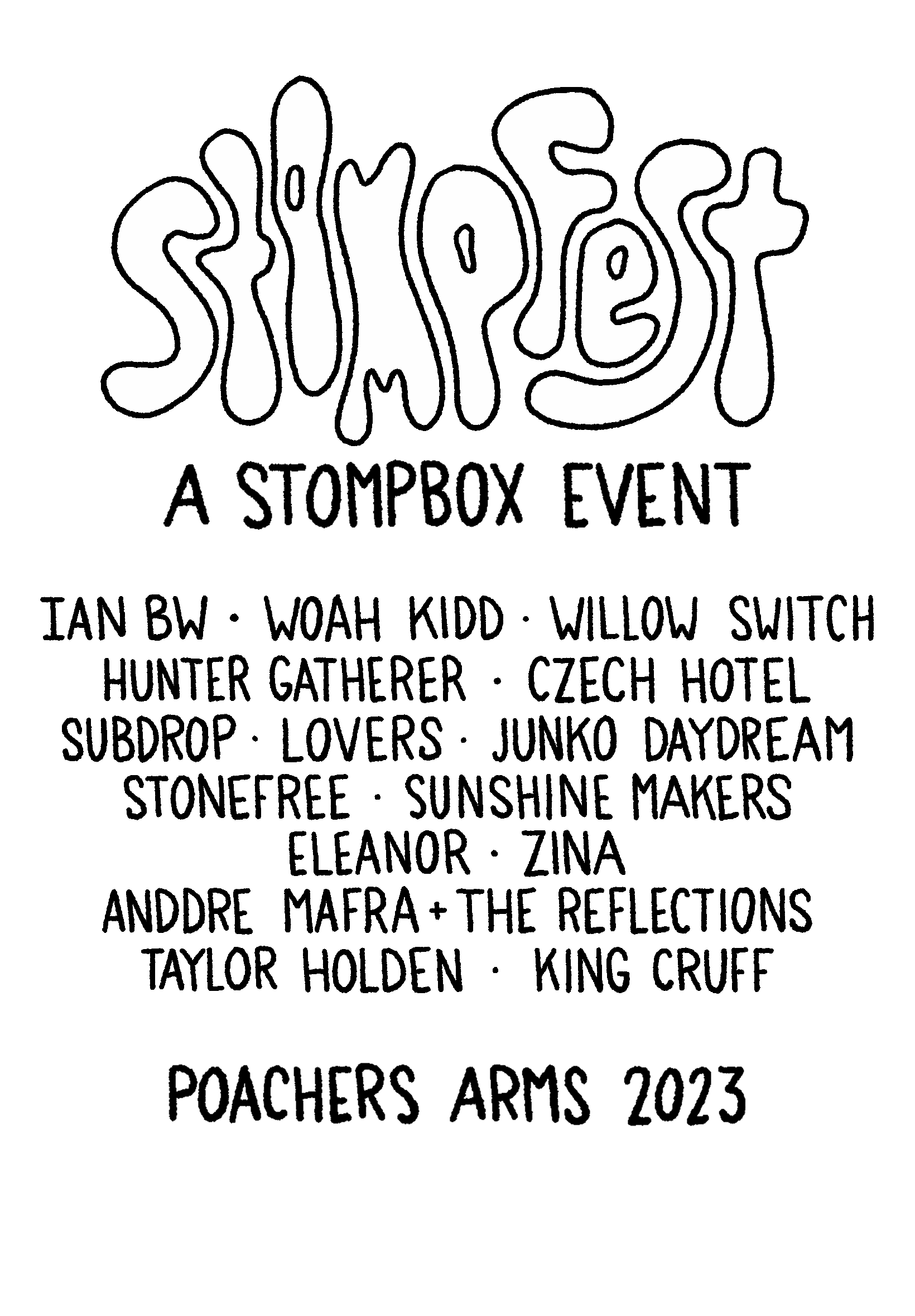
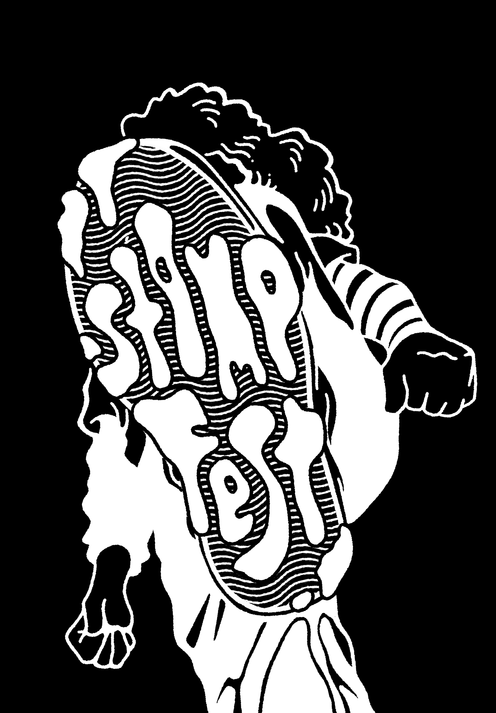
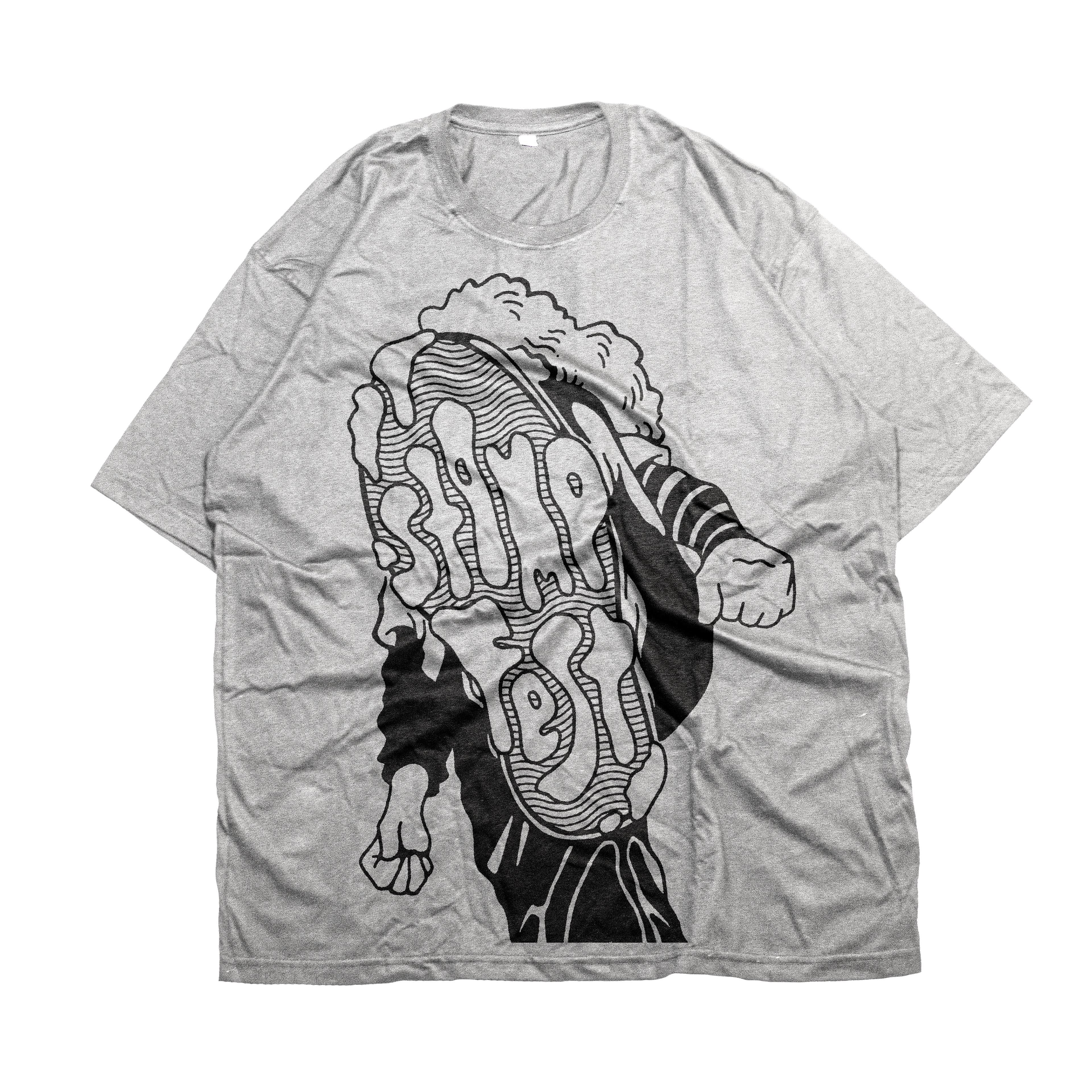
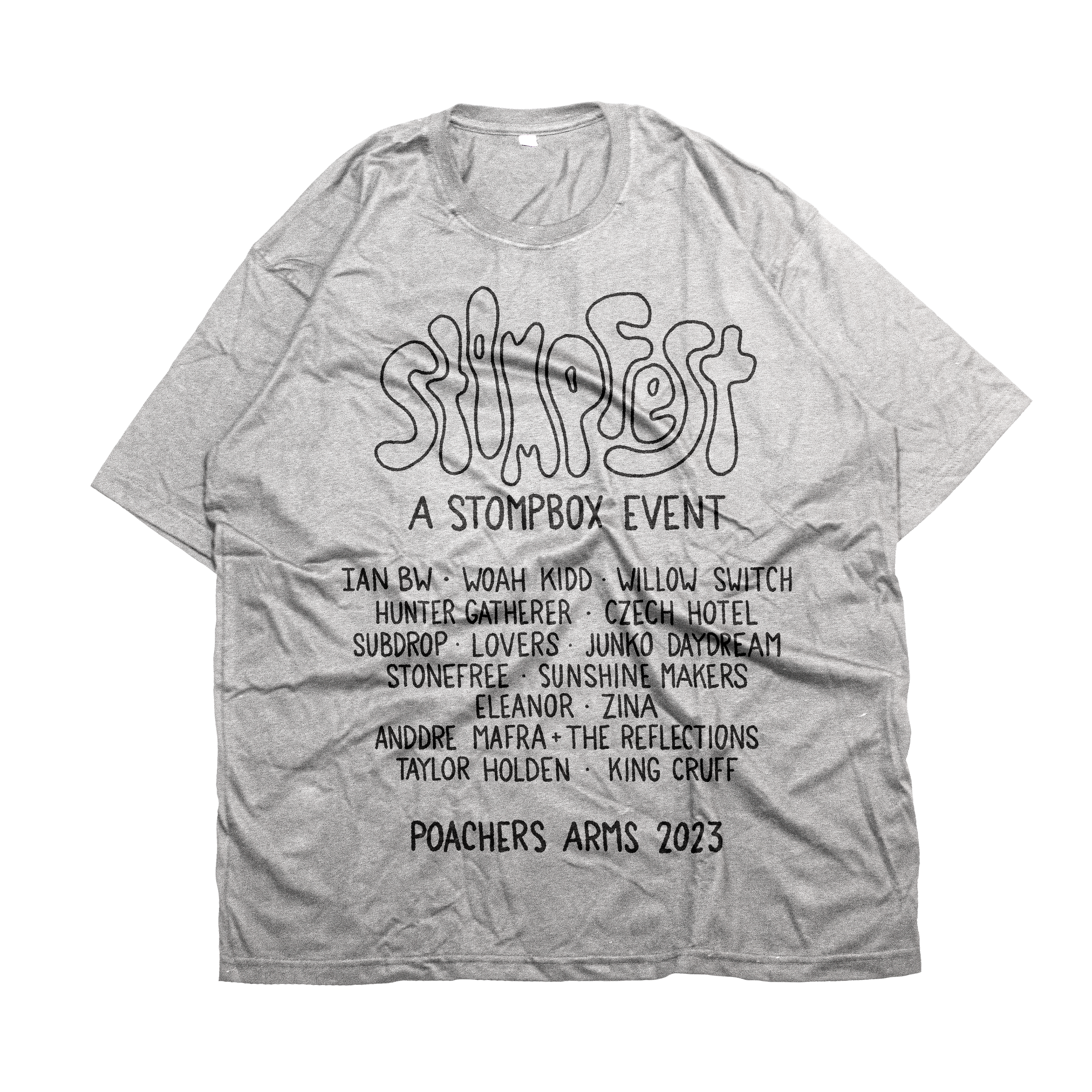
In creating the design for Stomp Fest t-shirts, I was asked to provide black and white versions of my designs as the print shop would dictate the colours available for us to choose from. They wanted the same graphic as the poster with the back of the shirt listing all of the artists with the date of the show, like a classic band tour tee.
Medium/Tools Used: ProCreate, Photoshop

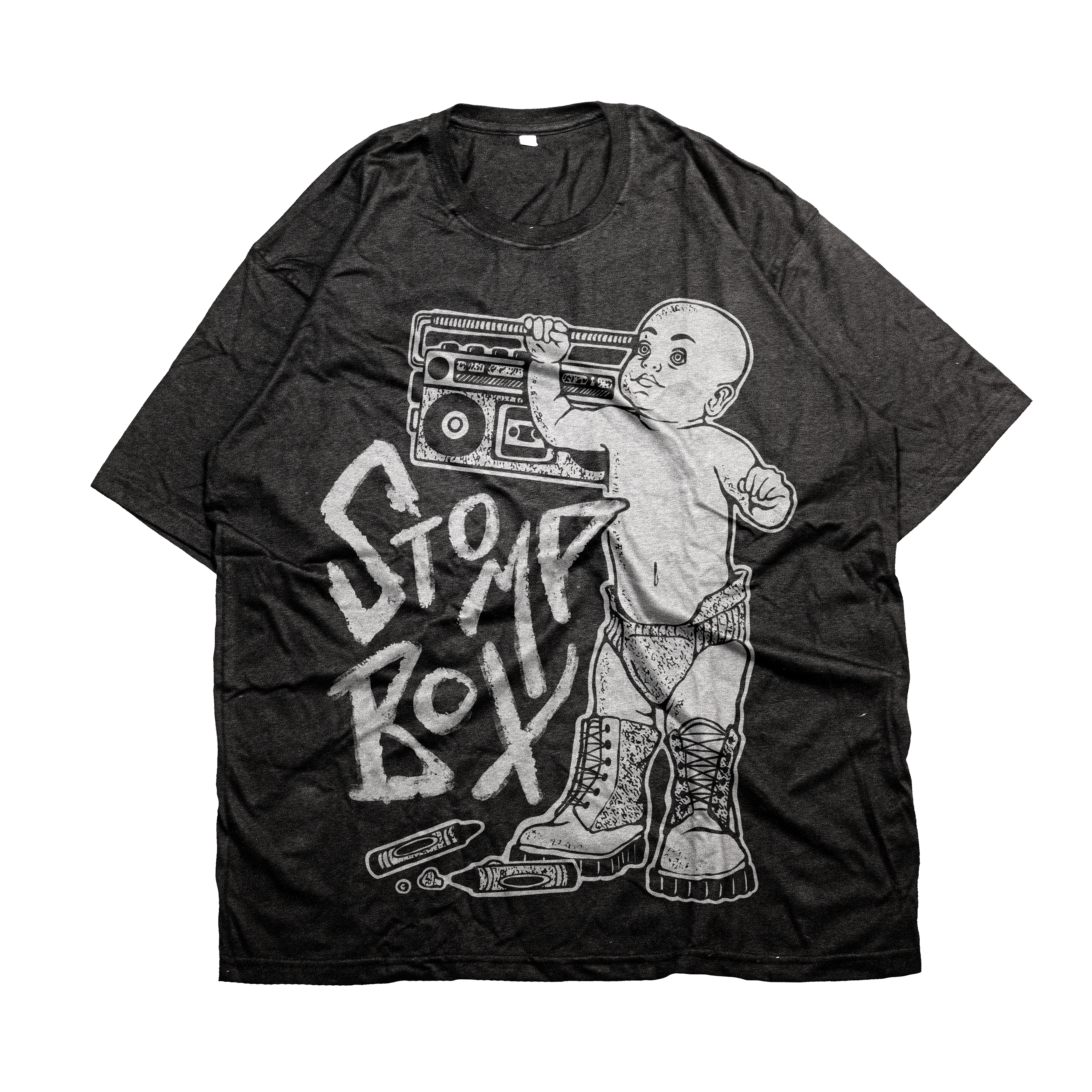
Client: Stompbox London
After being noticed by Stompbox London through my Instagram page, my first big job with them was creating an illustrative t-shirt design. After brainstorming we came up with the idea of having a baby punk mascot as Stompbox was just being "born" at the time.
I created several rough illustrations that would be transferrable to a t-shirt and they decided on the two shown above, which I finalized after making requested adjustments.
Medium/Tools Used: ProCreate, Adobe Photoshop

Client: Grogette's Living Room
Local house-show venue, Grogette's Living Room, enlisted me in making a gig poster. They gave me a lot of creative freedom in this design, only asking that I include their mascot, "Grogette", a baby Yoda doll dressed up in sunglasses and a feather boa.
In creating this gig poster I was inspired by the band names, as they all seemed to have a fiery theme to their names. I decided to make my design somewhat of a play off of the popular "disaster girl" meme which suited the goofy, fun vibe of the venue.
Medium/Tools Used: ProCreate, InDesign
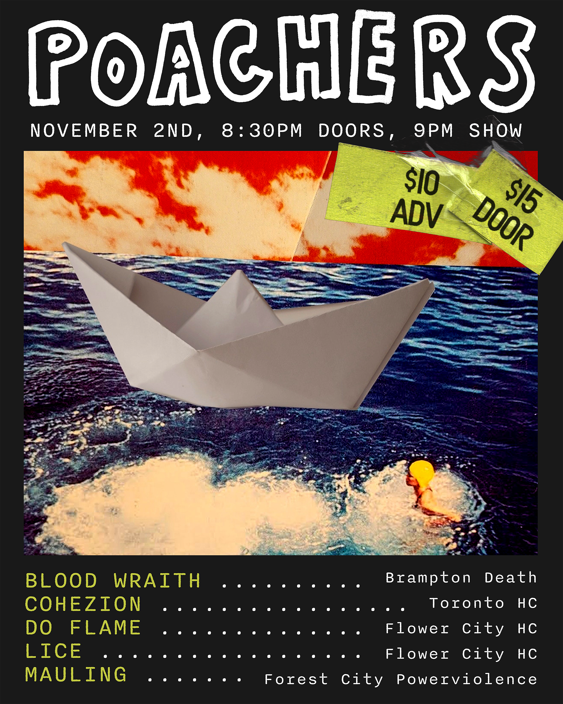
Client: Stompbox London + Poachers Arms
stompbox reached out to me once again to ask for a gig poster. They were stuck in a pinch with this one and gave me full creative freedom for a quicker turnaround. They were hosting a hardcore show at a local venue, Poachers Arms. Being a regular at shows like this, I knew I needed to create something edgy and vibrant.
One of my favourite things to incorporate in poster design is scanned, handwritten elements. I used a wide-tip Sharpie to write the venue name before scanning it into Photoshop. I also used Photoshop to create a unique collage as the main image and made a sticker mockup to show the admission prices for that grungey, DIY feel.
Medium/Tools Used: Adobe Photoshop, Adobe InDesign, Scanner
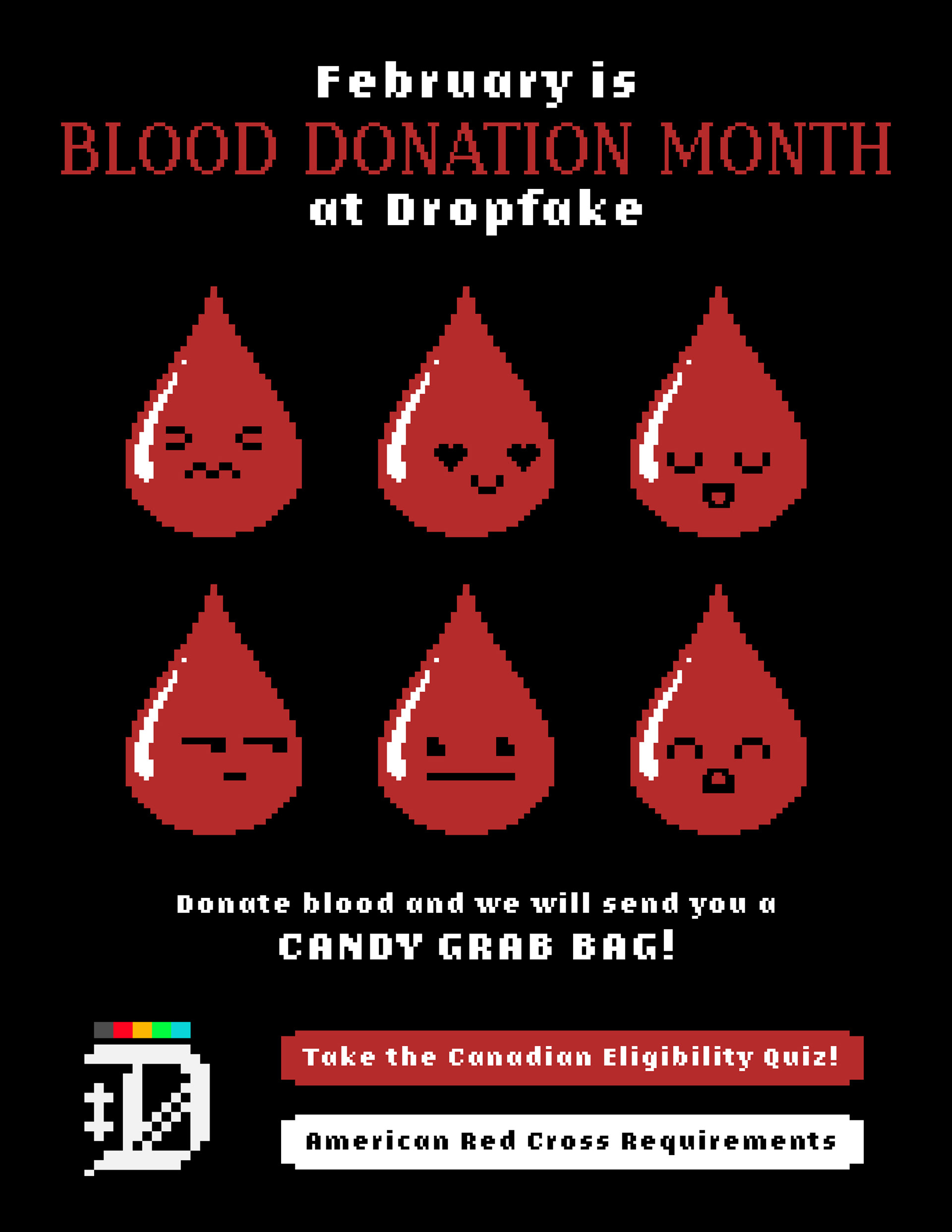
Client: DropFake
As a remotely working game design company, DropFake required an interactive PDF flyer to send to employees. The flyer was for DropFake's annual blood drive and had to include some information about the event as well as clickable links that employees could follow for more information.
I wanted the design to be eye-catching but still easily legible with only the required information. I wanted to continue the pixelated look of their company logo and used Adobe Illustrator to create cute pixelated blood drop characters with different expressions. After finishing the flyer in InDesign, I used Adobe Acrobat to create clickable buttons so employees could easily access the required websites.
Medium/Tools Used: Adobe InDesign, Adobe Illustrator, Adobe Acrobat
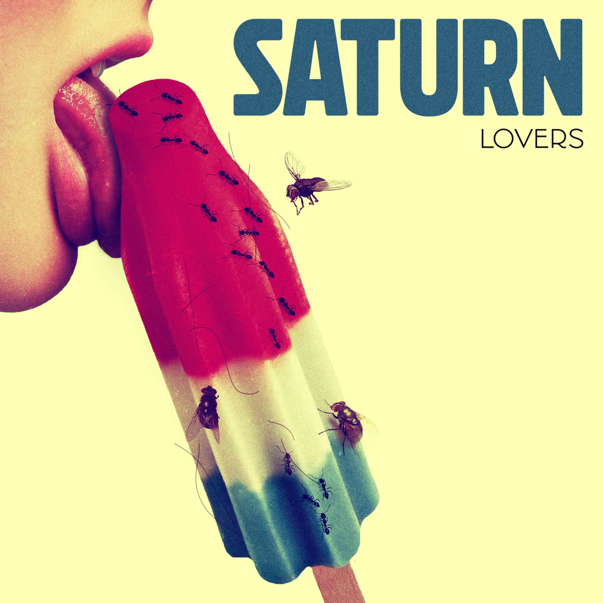
Client: LOVERS (Band)
London psychedelic punk band, Lovers reached out to me to design a cover for their latest EP release, Saturn. They gave me full creative freedom in creating this design for them and after listening to the song, I thought a vintage ad-inspired photomanipulation with some darker undertones would suit the song well. After running my concept by the band, I got the go-ahead and created this realism photomanipulation project using Photoshop and stock photography.
Medium/Tools Used: Adobe Photoshop, ProCreate, Scanner
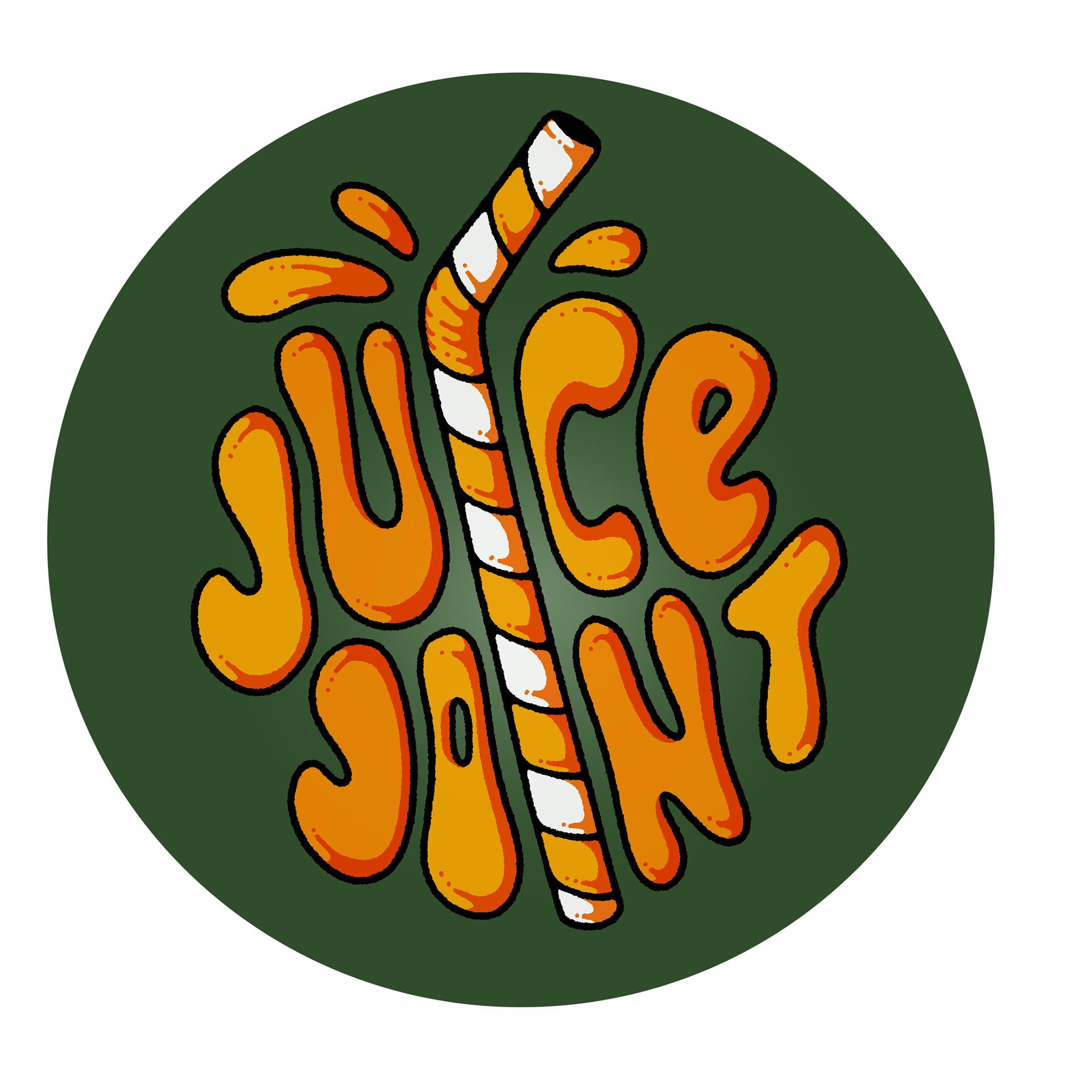
Client: Juice Joint (Band)
In creating a design for London lo-fi jazz band, Juice Joint, they asked for something high-energy, approachable and wanted their established colours present in the logo design; hot orange and a forest green. I thought incorporating the orange colour as the fruit would be interesting and would tie in well with the name of the band. We decided to go with this concept, using a straw and the shape of the orange to play off the name of the band while capturing that fun, energetic and approachable vibe they were after.
Mediums/Tools Used: Adobe Photoshop, ProCreate, Adobe Illustrator
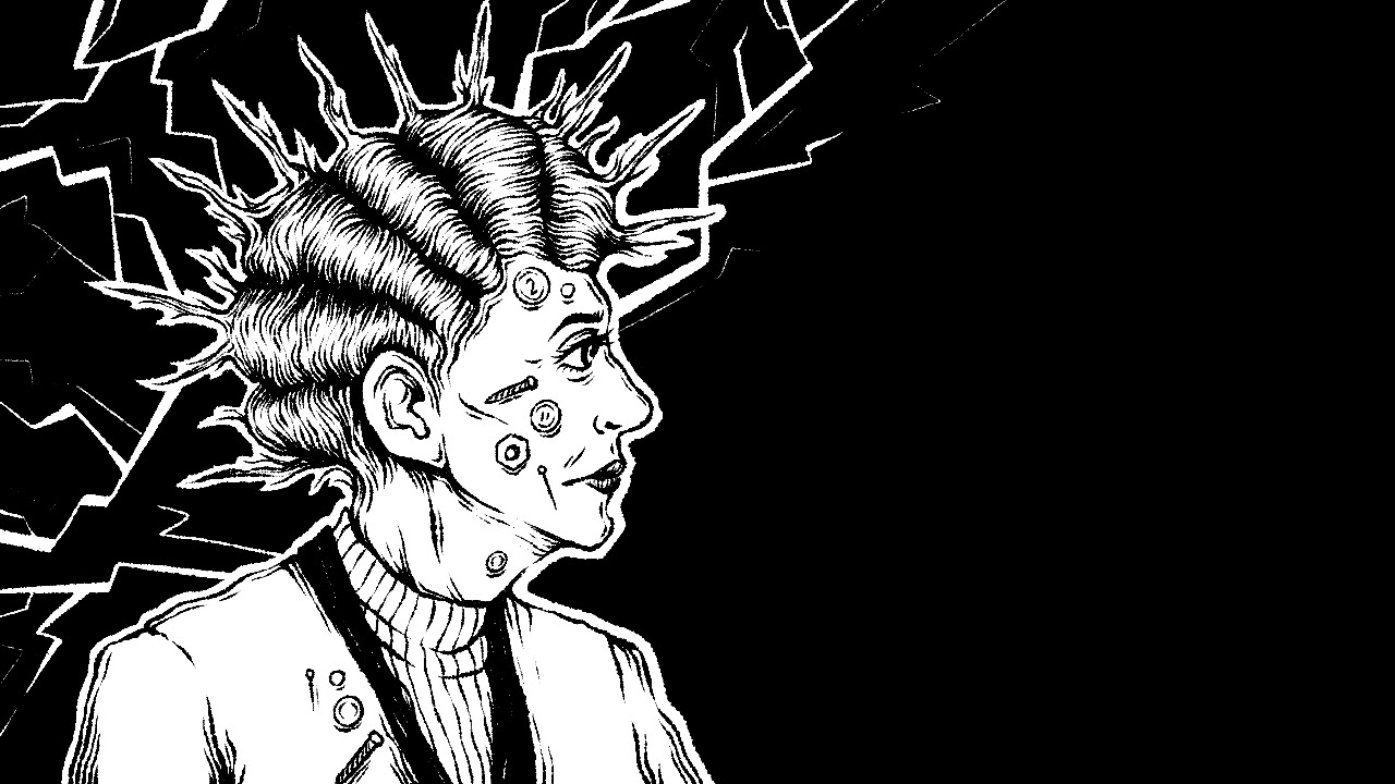
Electric Lady Illustration
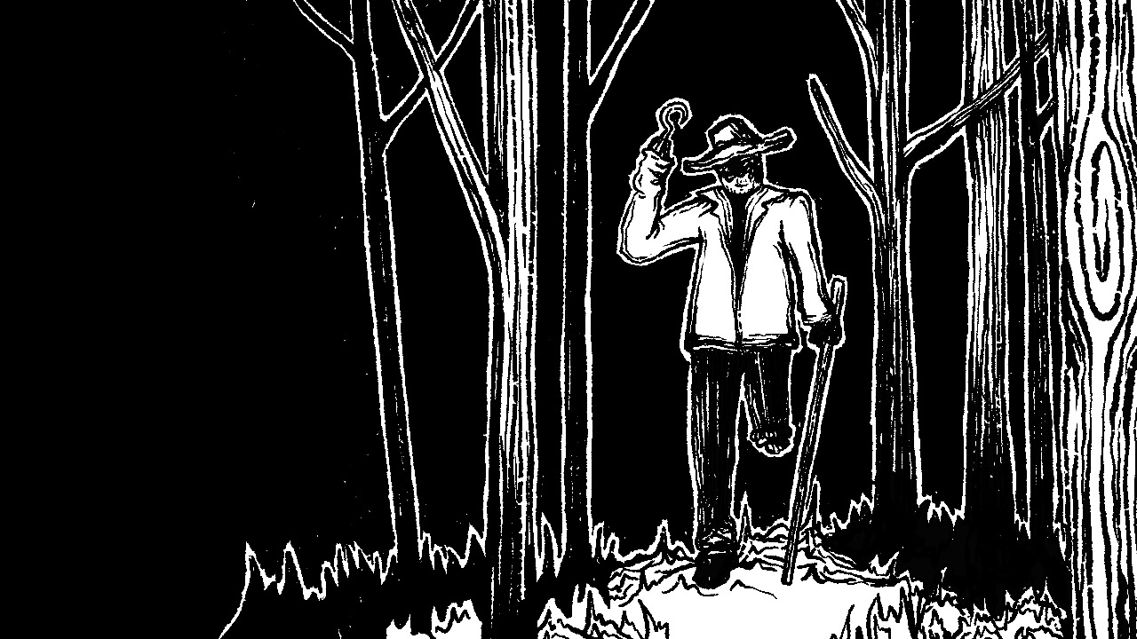
Anson Minor Illustration
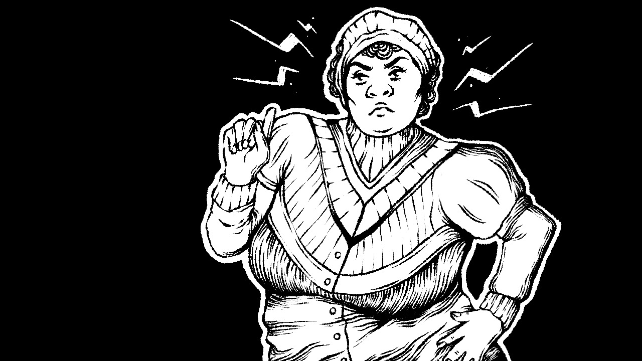
Clara Peters Illustration
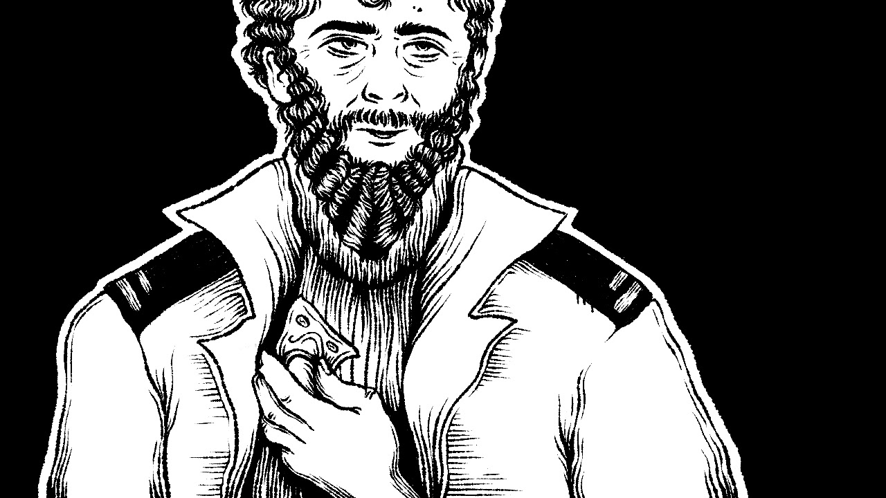
Cornish Illustration
Client: Theatre Nemesis
I was commissioned to create black and white illustrations to be used in a slideshow to accompany a theatrical storytelling event hosted by London playwright and poet, Jason Rip. I was given information on each of the characters/scenes that needed to be drawn and completed them using ProCreate and Adobe Photoshop.
Medium/Tools Used: ProCreate, Adobe Photoshop
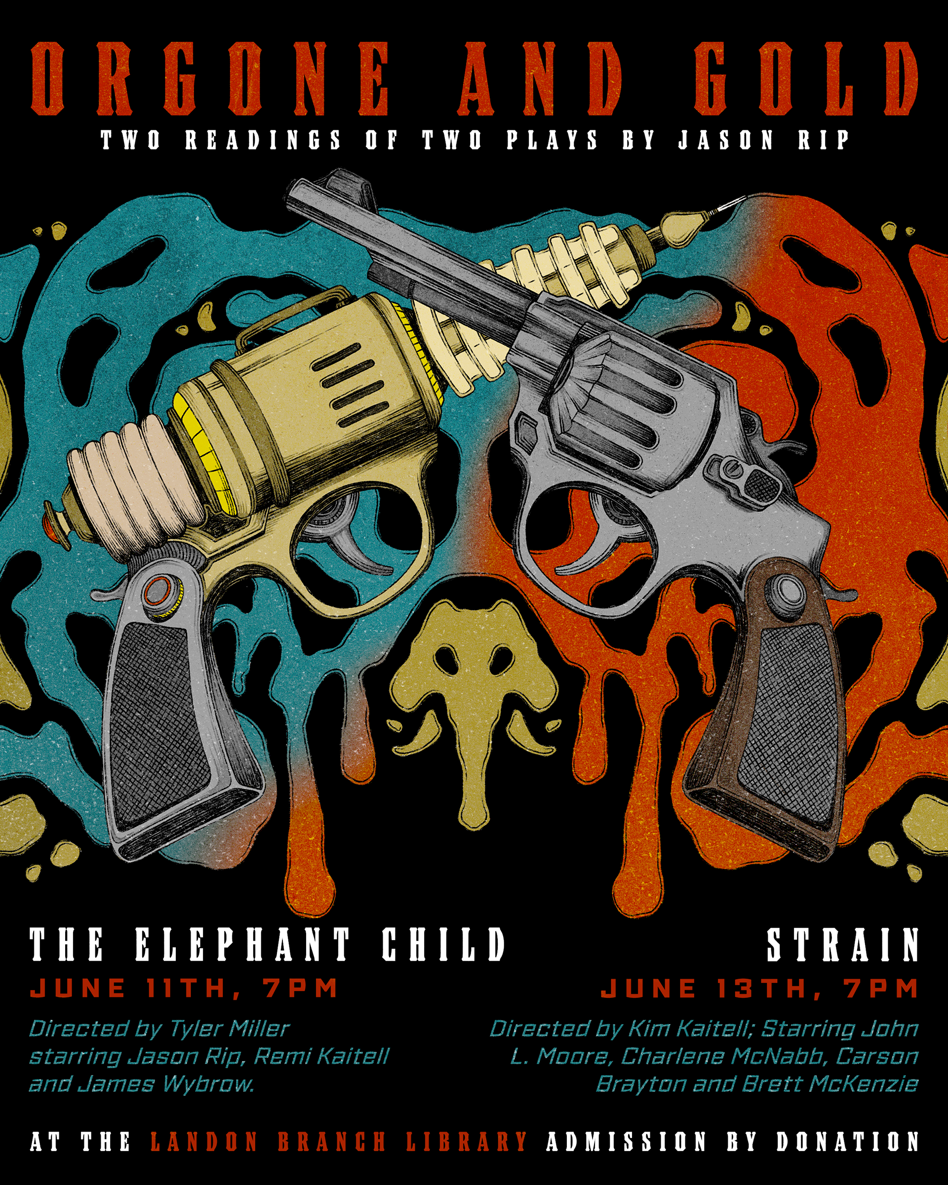
Client: Theatre Nemesis
I was once again commissioned by Theatre Nemesis, this time to create a poster for their upcoming show, Orgone and Gold. I was sent the scripts for each of the plays and was given creative freedom to create an illustrative poster that combines elements from each story. Each of the stories involves some form of "gun" and so I decided to create a crest with the instrument from each story. I also incorporated other elements in the Rorschach test-inspired background including gold, blood, blue orgone, and psychiatry/psychoanalysis.
Medium/Tools Used: ProCreate, Adobe InDesign, Adobe Photoshop
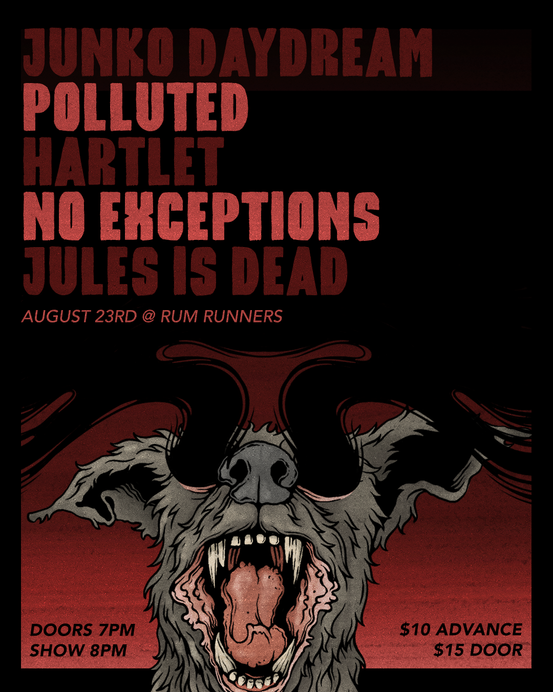
Client: Junko Daydream + Rum Runners
In creating this gig poster for London band Junko Daydream, they provided me with full creative freedom in designing this poster. I created an illustrative gig poster with bold, impactful fonts to highlight the bands, venue and event information.
Medium/Tools Used: ProCreate, Adobe Photoshop